Page 1 of 8 12345 ... LastLast
Results 1 to 25 of 179

Thread: Eastman "Logo"

  1. #1
    Registered User
    Join Date
    Jan 2005
    Location
    South Carolina
    Posts
    1,110

    Default

    I have read and heard so much about Eastmans, I am anxious to see one in person. With labor so cheap, and so many skilled artisans in China, I would expect them to be able to produce a first class instrument.

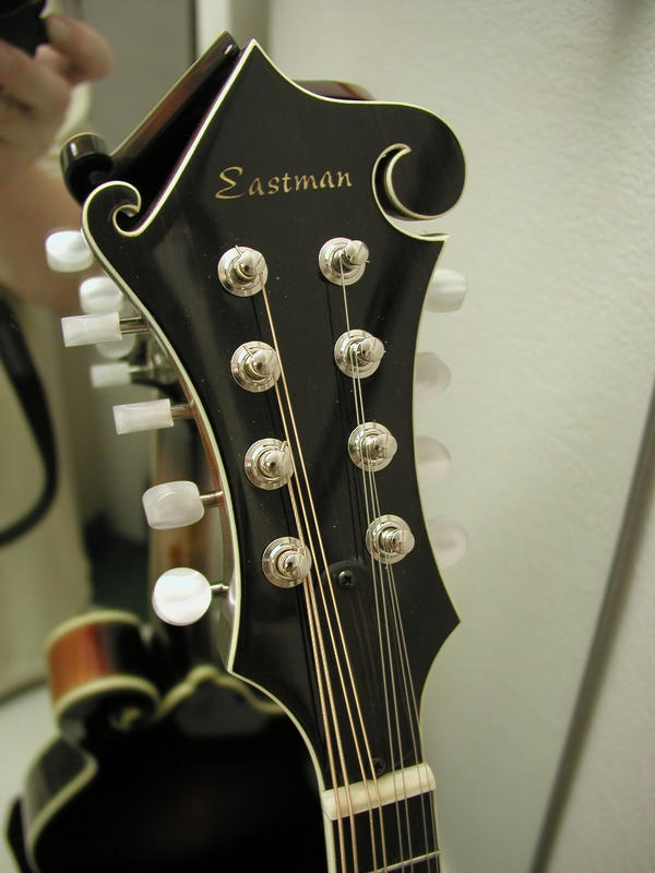
    But -------- for some reason, their logo just looks "cheesy" to me. First it appears to be painted or decaled on. It's orientation on the peghead is anything but artistic. It just seems to me that a little work on their logo, maybe even inlaying it in pearl with a nicer "font" and better layout would make them much more appealing.

    While I am "picking" on them, I must admit I'm not real crazy about the name either!
    Linksmaker

  2. #2

    Default

    Mine is covered with black electrical tape
    "Well, Yes, It is true that it did have random Hippie Sanding done to it"

    "It's about the journey and not the destination."

  3. #3
    Registered User
    Join Date
    Aug 2004
    Location
    Vancouver, BC
    Posts
    471

    Default

    Looks OK to me.
    And now there was no doubt that the trees were really moving - moving in and out through one another as if in a complicated country dance. ('And I suppose,' thought Lucy, 'when trees dance, it must be a very, very country dance indeed.')

    C.S. Lewis

  4. #4
    Registered User
    Join Date
    Jan 2005
    Location
    South Carolina
    Posts
    1,110

    Default

    Simon - really! I can't find a decent photo of it, even on their own website. I still don't like it, but it might be a little better if I could see a good image - it still won't change the "orientation" problem.

    Can anyone post an image of their headstock?
    Linksmaker

  5. #5
    Registered User John Flynn's Avatar
    Join Date
    Oct 2002
    Location
    Richmond, VA
    Posts
    8,076

    Default

    I've played several Eastmans and never noticed a problem, but I have to admit that is about the last thing I would look at on a mandolin. I mostly care how it sounds and plays and then just a general overall impression of how it looks. To me this is like saying, "I would buy that car, but I really don't like the way they put the company logo on the grille."

  6. #6
    Registered User Lane Pryce's Avatar
    Join Date
    Jan 2003
    Location
    Asheboro,NC
    Posts
    2,281

    Thumbs up

    I didn't have any issues with my 615 when I had it.I thought the script looked great. Lp
    J.Lane Pryce

  7. #7
    Registered User
    Join Date
    Dec 2002
    Location
    Fairfax Co., Virginia
    Posts
    3,013

    Default

    I'd rather have some ornamentation and a classy script or even just a big "E". Doesn't look that great on the guitars, either! But I've mentioned this to Gordon. It is a frequent comment and may well have prevented some people from getting Eastmans. On the other hand, the gaudy overdecoration of some imports seems to attract even more negative comments.
    Stephen Perry

  8. #8
    Registered User John Flynn's Avatar
    Join Date
    Oct 2002
    Location
    Richmond, VA
    Posts
    8,076

    Default

    The Elderly site has Eastman headshots. I admit, they are not the best logos I have ever seen, but they don't look bad and it would never keep me from buying one if everything else was right.

    http://www.elderly.com/brand/90N_other.html


  9. #9
    Registered User f5joe's Avatar
    Join Date
    Sep 2002
    Location
    Knoxville, Tennessee
    Posts
    630

    Default

    So Links, I guess "Michael Kelly" really gets you going?

    ..... f5joe

  10. #10
    Registered User
    Join Date
    Jan 2005
    Location
    South Carolina
    Posts
    1,110

    Default

    No, Joe it doesn't, but neither does the mandolin! Nice for the price, but not just for me.

    Gianna & Steve,

    I agree totally with you. I think "overly" ornamentaion of an inexpensive import is worse than nothing at all. I think simple, nicely stated logos or names just add to the "artistc" beauty of an instrument. I think Collings logo, and orientation on the headstock is quite nice - same with Gibson, Weber - OK, Gilchrist, Monteleone, et.al) As somewone with an architectural (art) background, I look at everything.

    Although the headstock logo may not be the deciding factor for most buyers, it might be for some, so why eliminate them! I mentioned in another thread that there are some great sounding and playing mandolins (by smaller builders) that I would just not consider woning due to poor craftmanship. This is certainly noy the case with Eastmans, but if I were them I would be proud enough to spend a little more time and effort on their logo.

    Probably petty, but that's just me!
    Linksmaker

  11. #11

    Default

    I think the thing that bugs me about the Eastman logo is that it doesn't say: "The Gibson". Just kidding, but I DO wish they'd run it at an angle like Gibson. Because of the long, straight angle above the word Eastman, it makes the logo appear to be crooked, in fact, running downhill. I think the only logos that work when they're placed straight on a mandolin peghead, are short names or logos. JMO
    Fred

  12. #12
    Registered User
    Join Date
    Feb 2005
    Location
    Pa.
    Posts
    251

    Default

    I guess you should turn this into a design the eastman logo contest. (Maybe they will use the winning logo and give first mando to the winner.)
    Daryl

  13. #13
    Bill Healy mrbook's Avatar
    Join Date
    Apr 2003
    Location
    Schenectady, NY
    Posts
    695

    Default

    Logos, gloss or matte finishes, all types of ornamentation - I notice them when I open the case, but never think a bit about any of those things when I play. There are probably people who don't like the way Gibson puts their name on, too.

  14. #14
    Registered Person
    Join Date
    Jan 2003
    Posts
    1,128

    Default

    Personally, I like the way Gibson put it on in the early to late 20's, kinda like they do it now on some. Also the real early Gibsons are great. Classy. Hated the 70's Gibson logo. Even on guitars. Martin's logo has always been my favorite, though.

  15. #15
    Registered User
    Join Date
    Feb 2005
    Location
    Pa.
    Posts
    251

    Default

    Or maybe they should do something bold and write "eastman" in Chinese on the headstock. No question on where they would be made then.
    Daryl

  16. #16
    Registered User Onesound's Avatar
    Join Date
    Sep 2004
    Location
    Lancaster, PA
    Posts
    340

    Default

    Considering the shape which covers a lot of real estate, I agree that the headstocks look uninspired and booring. There certainly is plenty of room for a tasteful inlay of some sort. One would think that Eastman would want their headstocks to compliment the high artistic and craftmanship quality put into their mando bodies.

    Cheers,
    Brian
    Cheers,

    Brian

    Angels don't play harps, they play mandolins

  17. #17
    coprolite mandroid's Avatar
    Join Date
    Oct 2002
    Location
    Outer Spiral Arm, of Galaxy, NW Oregon.
    Posts
    17,123

    Default

    Chinese characters would be nice, far east, man!
    writing about music
    is like dancing,
    about architecture

  18. #18
    Registered User f5joe's Avatar
    Join Date
    Sep 2002
    Location
    Knoxville, Tennessee
    Posts
    630

    Default

    Sort of an understated beauty, me thinks:

    ..... f5joe

  19. #19
    Registered User
    Join Date
    Mar 2003
    Location
    knoxville, tn.
    Posts
    119

    Default

    I LIKE IT, IF IT SOUNDS GOOD I LOVE IT!

  20. #20
    Registered User dwc's Avatar
    Join Date
    Sep 2004
    Location
    Charleston, SC
    Posts
    389

    Default

    Thats why I love my Eastman (along with the tone and playability), nothing on the headstock at all.


    Attached Thumbnails Attached Thumbnails Click image for larger version. 

Name:	805A1.jpg 
Views:	189 
Size:	23.7 KB 
ID:	6872  
    Northfield Artist Series F5 (2 bar, Adirondack)

  21. #21
    Ursus Mandolinus Fretbear's Avatar
    Join Date
    Sep 2002
    Location
    Copperhead Road
    Posts
    3,140

    Default

    That Eastman logo doesn't look so bad; I have a beautiful 35 year old Yamaki dreadnaught that had a horrible gold decal across the peghead, underneath the finish; I stripped it off and replaced every last removable part on it and have never regretted it, I'm glad they didn't inlay it with anything, or else I would have been stuck with it......
    But Amsterdam was always good for grieving
    And London never fails to leave me blue
    And Paris never was my kinda town
    So I walked around with the Ft. Worth Blues

  22. #22
    Registered User PlayerOf8's Avatar
    Join Date
    Sep 2002
    Location
    Chi-town
    Posts
    365

    Default

    I have not tried it yet, but I was told that a little lighter fulid on a q-tip will take the gold paint right off. I'm not suggestion that anyone do this, I'm just passing along something that I heard.

    GM

  23. #23
    Registered User John Flynn's Avatar
    Join Date
    Oct 2002
    Location
    Richmond, VA
    Posts
    8,076

    Default

    Quote Originally Posted by
    Or maybe they should do something bold and write "eastman" in Chinese on the headstock. No question on where they would be made then.
    Well, if you really want truth in advertising, the guys in Nashville should put "Da Geabs'n" on thier headstocks so we know where they are made!

  24. #24
    Registered User
    Join Date
    Sep 2004
    Location
    Clarksburg, MD
    Posts
    240

    Default

    Enough about the logo guys, it's been the bane of my existence for about the last two years. I don't know if anyone realises how difficult it is to design something to fit on the headstock of an instrument. We have had many really good graphic designers work on this and all they seem to be able to come up with is something that is so derivative that it would be like stealing, or something that looks like it ought to be on a sneaker and not on a mandolin. We decided to use the logo you see because it was simple, mostly unobtrusive and a reasonable fill in until we came up with the definitive Eastman logo. Since then we have looked at hundreds of designs and they all suck.

    So what's a company to do?

    What do you think about this. The going rate for a logo design of this type is about $2kish. I know that there is someone out there in mandocafe land that can design a killer logo for us that will be unique yet classic in design. Come up with a design that we decide to use and we will reward you with a brand spanking new 900 series mandolin of your choice (with your logo inlaid into it and a certificate identifying it as the first instrument ever produced with that logo) worth $3kish,immortality in the mando world and bragging rights at every picking session you go to for the rest of your life where someone's playing an Eastman. (Of course nobody will believe you but that's neither here nor there).
    Do we have any takers?
    Gordon
    ps. Remember, the design has to be inlaid into the headstock so it can't be too fiddly and it needs to be instantly recognizable as an Eastman. Art deco, classic, ultra modern, we don't care as long as it works.

  25. #25
    Registered User
    Join Date
    Jan 2005
    Location
    South Carolina
    Posts
    1,110

    Default

    Gordon:

    Thanks for your reply! I promise, I wasn't jumping on you or your mandolins. I can't wait to see and play one!

    However, my original question/comment was honest. To many folks, the peghead logo just does not matter. To many others, it makes a lot of difference, even to the point that it definitely affects their buying decision. With the laws of "supply and demand", as your mandolins get more expensive (I hope you keep them reasonable) a good looking peghead logomight make a difference.

    Your design contest is a great idea and I will make sure to submit an entry. I am in the design field (golf courses), so I have a pretty good eye for aesthetics. I'll give it a shot!

    Thanks again for the reply!
    Linksmaker

Similar Threads

  1. New colors for the eastman/alden "mandocaster"
    By Jim MacDaniel in forum Four, Five and Eight-String Electrics
    Replies: 36
    Last: Nov-11-2007, 3:44pm
  2. Eastman's first "Big Name" endorsement
    By mr51 in forum General Mandolin Discussions
    Replies: 17
    Last: Apr-15-2006, 9:58pm
  3. Eastman "A"  605
    By abelville in forum General Mandolin Discussions
    Replies: 5
    Last: Feb-10-2006, 8:40pm
  4. Replies: 5
    Last: Jan-19-2006, 1:35pm
  5. Eastman "Gen X" fiberglass case
    By flairbzzt in forum Equipment
    Replies: 2
    Last: Jan-18-2005, 3:27pm

Bookmarks

Bookmarks

Posting Permissions

  • You may not post new threads
  • You may not post replies
  • You may not post attachments
  • You may not edit your posts
  •